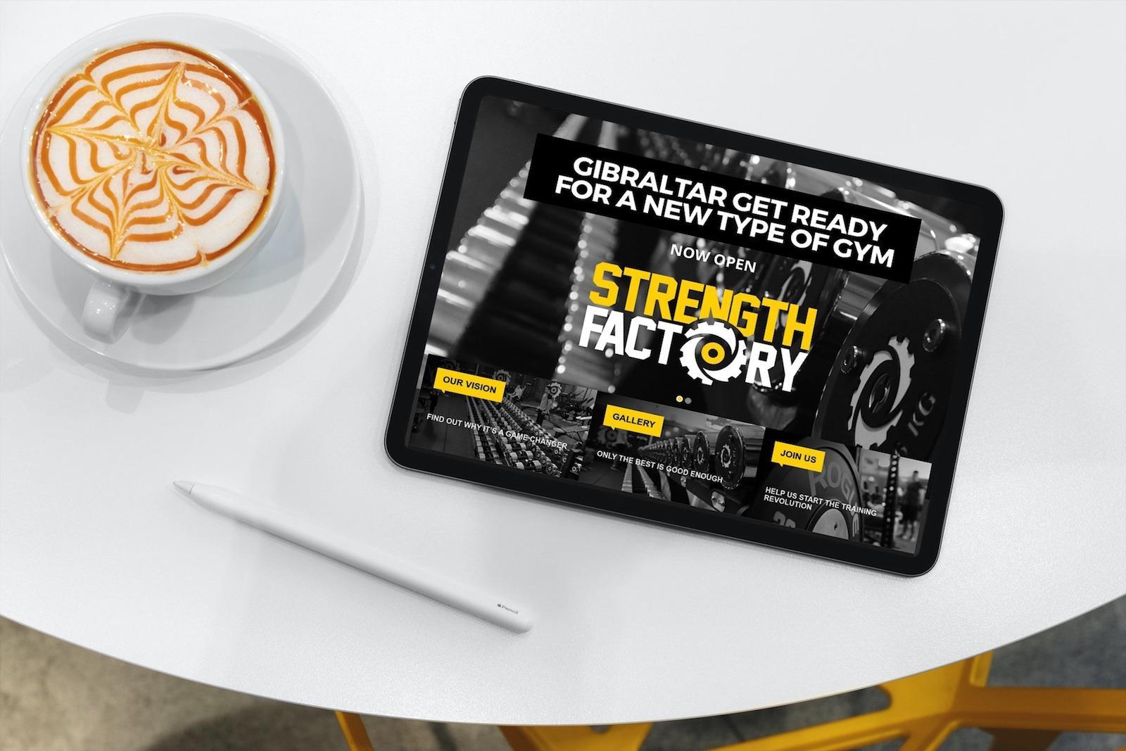
Strength Factory
Website design & branding
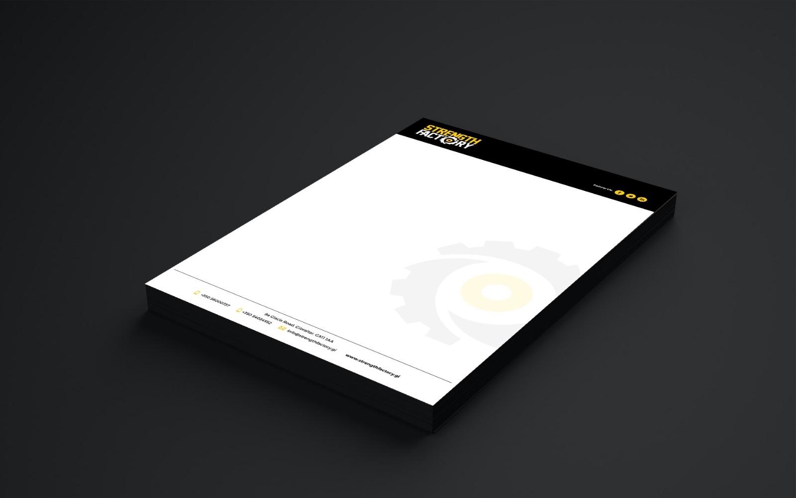
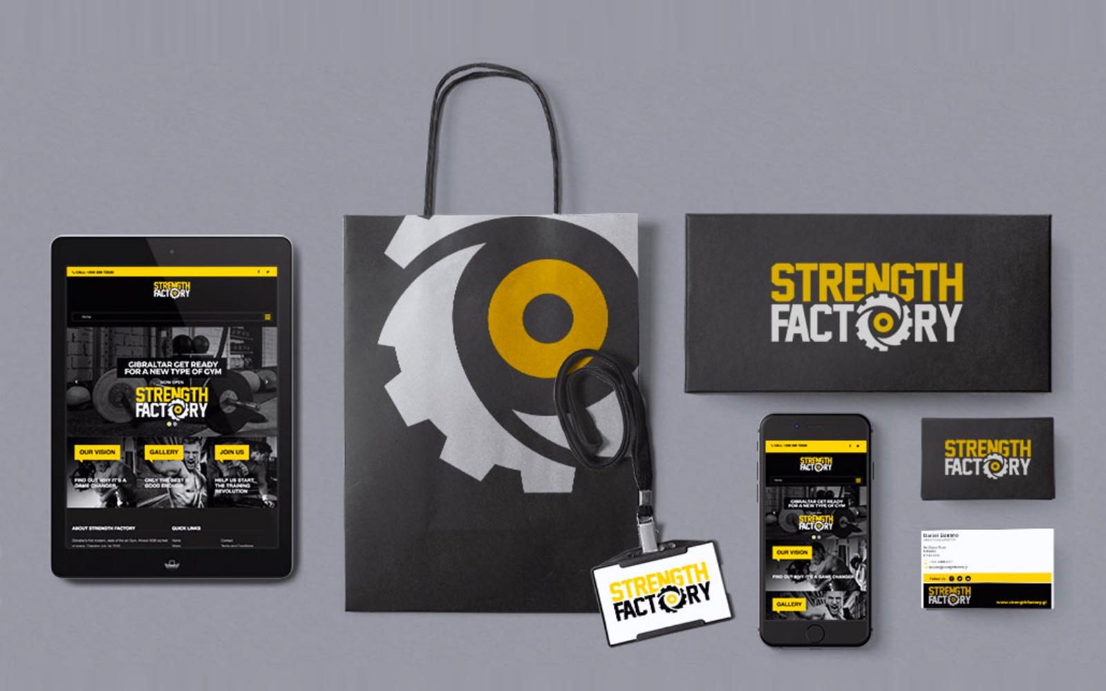
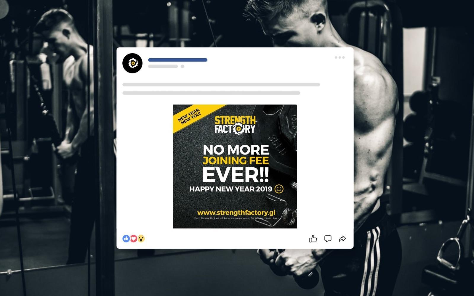
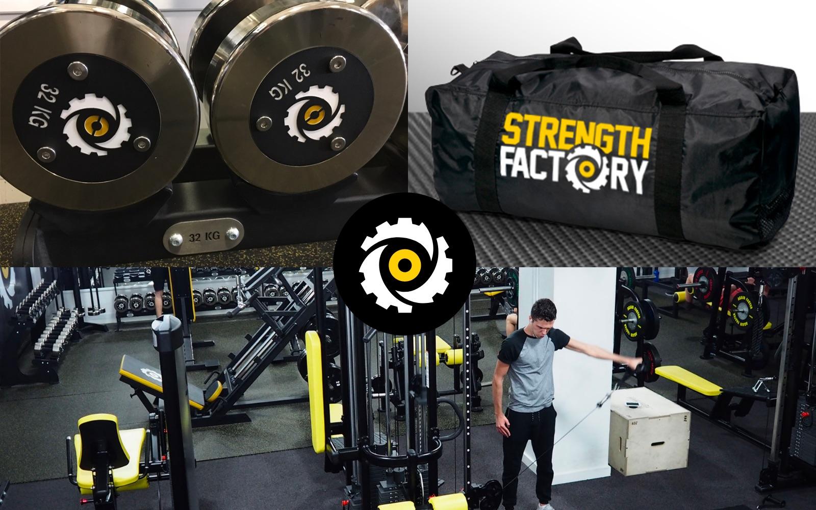
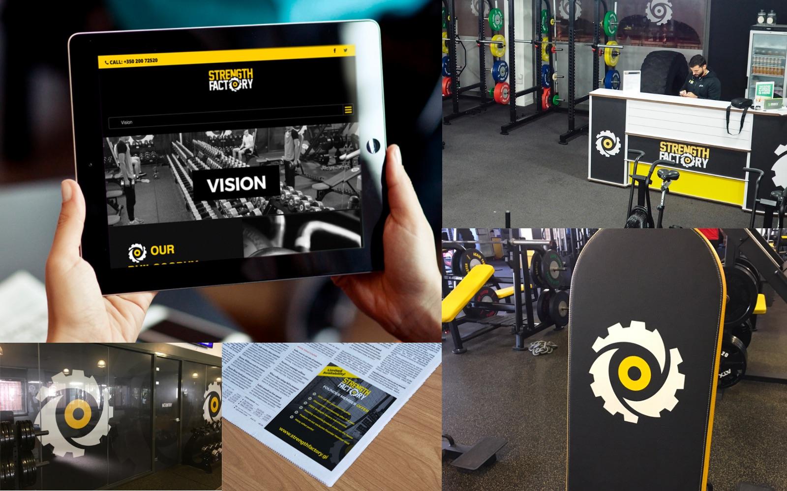
The client was keen on having a powerful logo and brand identity that would allow them to market their gym in a clear and original way. They really wanted some kind of symbol that could be used across all media.
After many ideas of classic gym symbols such as dumbbells, barbells etc, we came up with a cog. As this is the Strength ‘Factory’ it made a lot of sense. The cog was created using an aggressive and original illustration that is both recognisable, but original too.
The cog, the colours and the fonts have given Strength Factory a great brand that has already impacted the local community.
